Converter Tech
— dual brand architecture for global wind energy
At a glance
Brand Design, Rebranding & Strategy, High-Performance Web, Development, UI/UX Architecture, Design System
Challenge
With over 24,500 converters installed globally and a legacy spanning SEG, IDS, and Woodward, Converter Tec needed to split its global identity into two distinct operational units: OEM manufacturing and Aftermarket & Service. The core challenge was to create two focused digital experiences that speak to completely different target audiences—turbine manufacturers versus asset operators—without fracturing the shared parent brand.
Our solution
We guided Converter Tec through a strategic rebranding process, establishing a unified design system that powers two tailor-made, high-performance web platforms. From early concepts to final code, we architected distinct user journeys: a showcase of engineering precision and scale for OEM, and a fast, solution-oriented portal for Aftermarket & Service.
The result
Two high-speed digital flagships that position Converter Tec as an agile, future-proof leader across the entire wind energy lifecycle. The modular architecture ensures seamless content operations, clear target group navigation, and a modern digital presence that matches their industrial authority.
Desktop precision and field-ready mobile UX
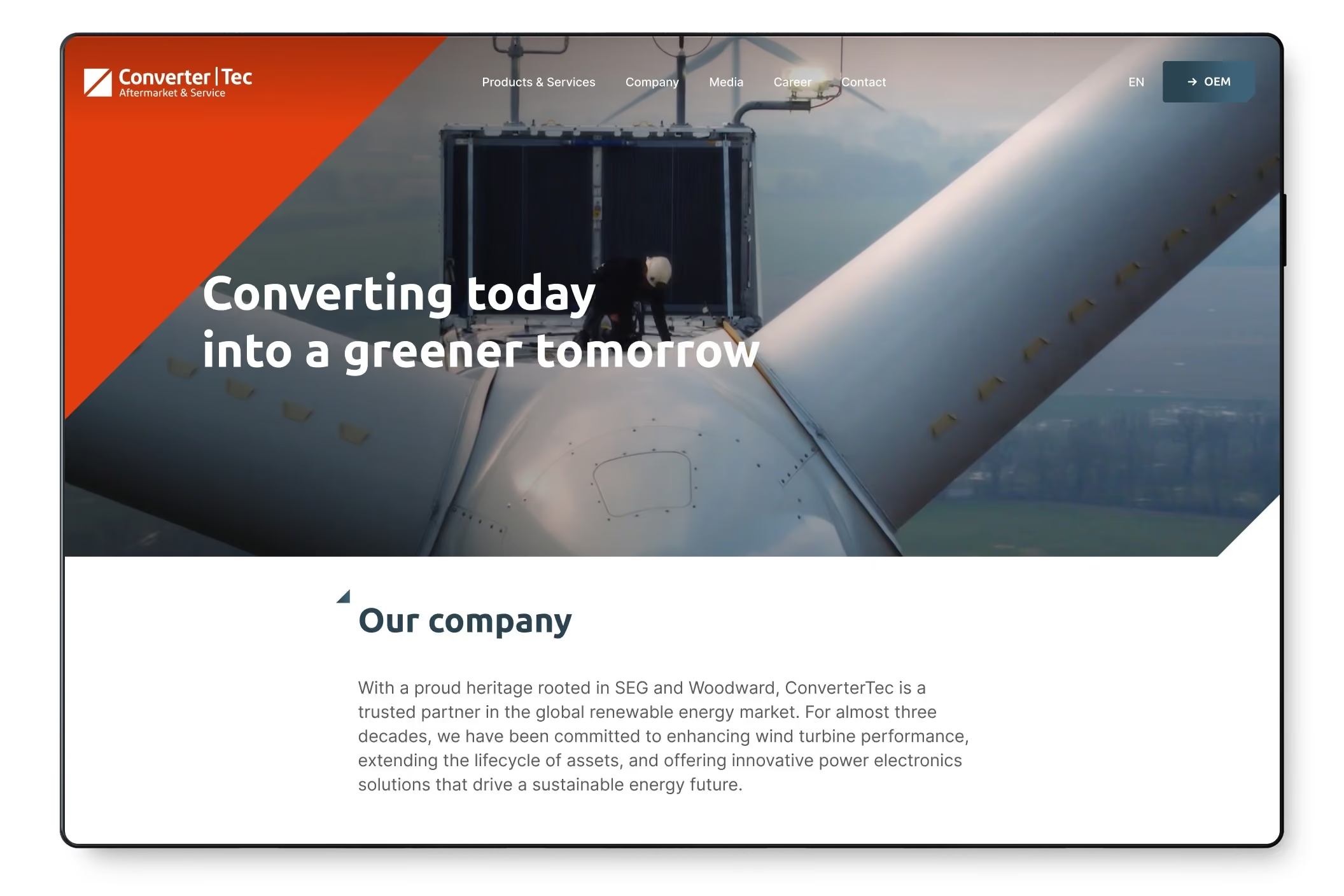
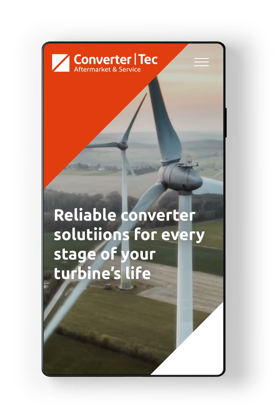
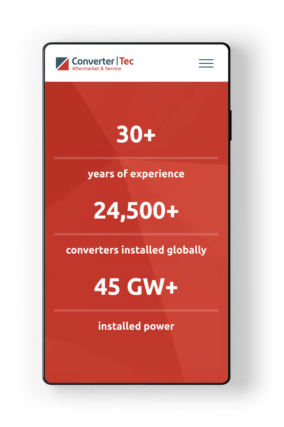
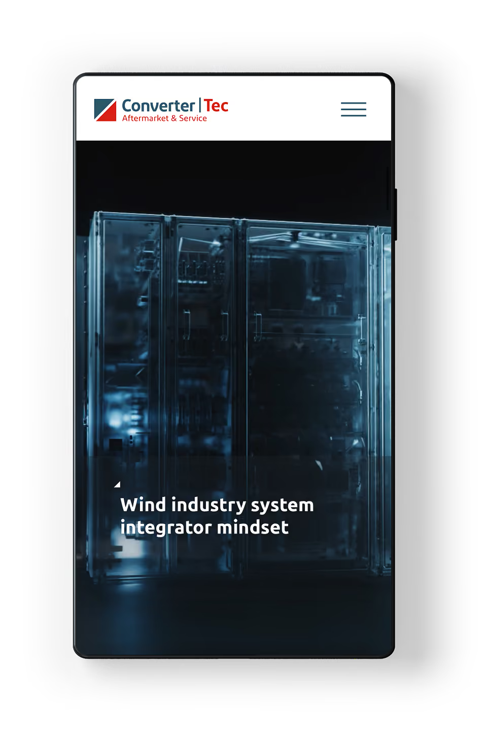
While the desktop interface utilizes spatial multi-column layouts to detail complex converter services, multi-brand solutions, and global locations side-by-side, the mobile experience rearranges these dense technical structures into an agile, single-column workflow. Complex navigation trees are condensed into an intuitive, multi-level mobile menu, and global contact hubs transform into one-tap phone and email triggers—allowing field engineers on-site to navigate legacy platforms and reach regional support teams instantly.
Visual Direction and Imagery
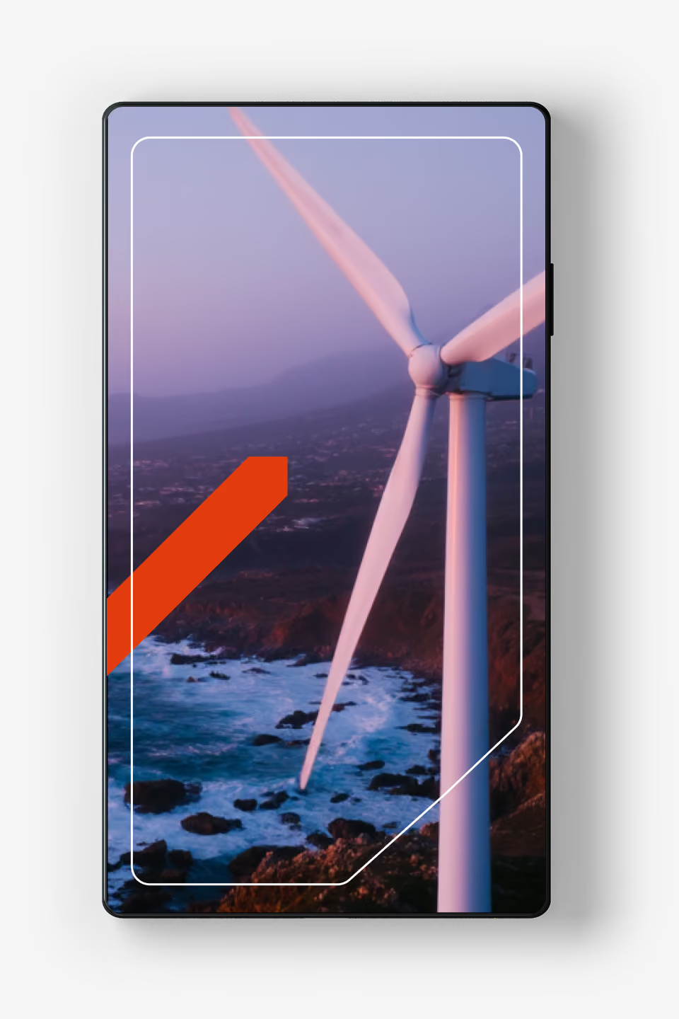
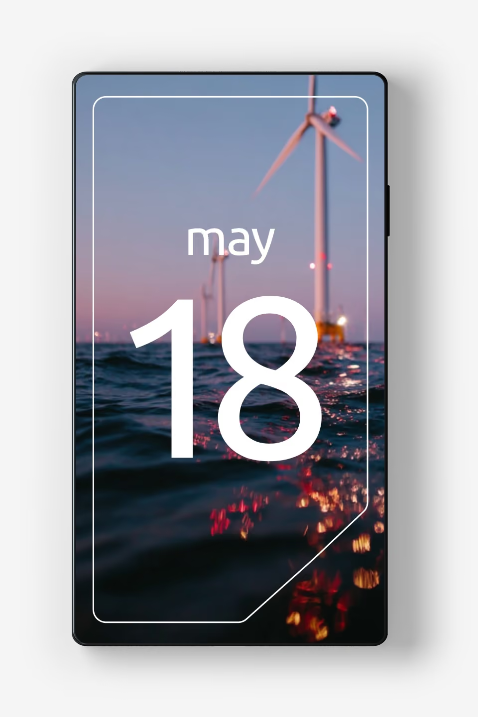
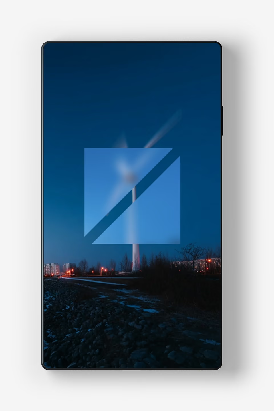
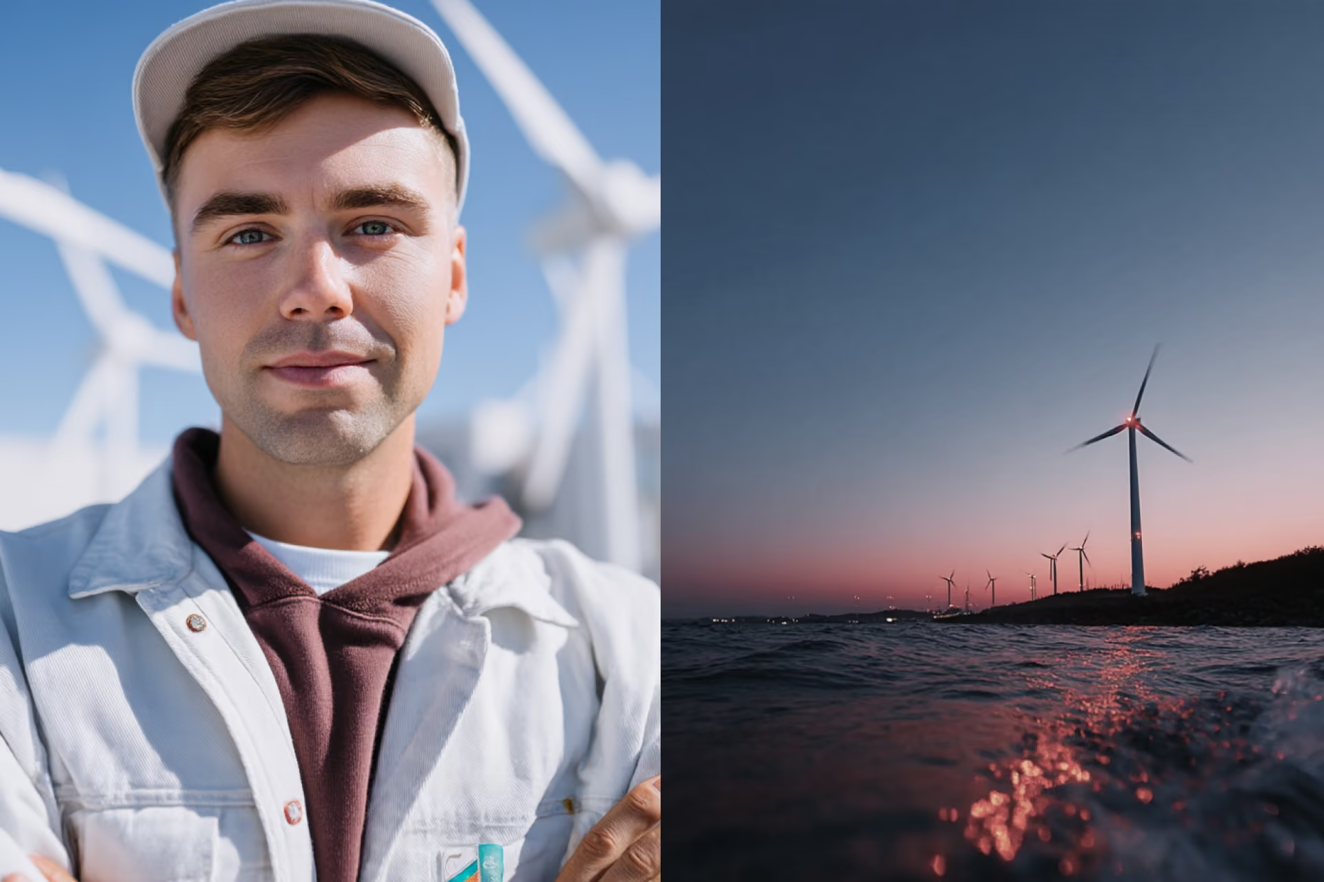
The visual concept bridges industrial reality with the brand’s core color palette. Clean, daylight photography delivers a clear, professional, and documentary look for on-site operations and technical details, while early morning and twilight shots of wind farms wrap scenes in deep blues and warm reds. This precise balance directly mirrors the two brand colors—connecting both OEM and Aftermarket under a shared, atmospheric visual identity.


Future Outlook & Brand Dynamics
Dynamic Brand Extension: Creating scalable design variations and visual suggestions to ensure a flexible, future-proof framework for upcoming touchpoints and continuous brand growth.